We’ve been hearing a lot re-brands in the last 12 months. It seems that every sector, from big corporations to non-profits and from government-affiliated institutions to cities big and small are making decisive moves. They are thinking hard about their names, their logos, and ultimately their “brands”. But branding a business of any size should not be done without careful consideration.
In 2015 alone, we saw food giants Kraft and Heinz merge into a mega-concern, linking two firms that each with a half-dozen billion-dollar brands. While the two firms carried their plans forward with ambitious marketing initiatives like retooling their product lines to include more “clean eating”, the merge posed another challenge: take two famous brands and fuse them into one, with a single logo or brand mark.
Meanwhile a few highly-touted companies in the ever-changing tech space restyled their looks and logos too. And some of these firms (including music streamer Spotify and ride-sharing star Uber) got their biggest fans and customers in a tizzy about the changes and new designs of their logos. While Spotify opted simply for a brighter, more visible green app icon, Uber went more for a tech-centric stab at the re-brand. Both changes left users and some design pundits less than pleased.
Just the same, cities and municipalities focused branding last year and continue to do so. Cities like Petersburg, Virginia, with its clever promotions and “cool swag like pins and magnets”, as well as Boston, hawking a new underlined “B” logo on sporty baseball caps, set out to make their names stand out. Some, like Newark, Delaware (pronounced “New Ark”) sought to tout greenness and flora. In addition, the hope is to separate its name from that other Newark (pronounced “New-werk”) in New Jersey.
Whether these locations sought to take a page out of corporate America’s handbook, or brand with a totally new approach, the important part is that they have re-branded with the aim of courting attention and appealing to new tourists, businesses and future residents. It appears that most of these cities — from Amsterdam to Yonkers, New York — started with a new logo.
Perhaps your business and the companies you serve as a marketing expert haven’t felt the need for a re-brand. Or maybe you are interested in retooling your logo but the fear is, “How do I re-brand and get it right?”
Here at Idea Custom Solutions, we’ve worked with countless small and medium-sized businesses on everything from new logos to branded ranges of marketing collateral and promotional products to match customers’ tastes. We’ve spent years working on re-brands, and know that reaching new customers while keeping existing ones, can be simpler than you think.
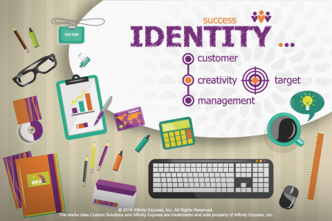
Consider Your Message. Be Who Your Customers Know
A few weeks ago we highlighted some simple wisdom. Industrial Distribution (ID), an online magazine for heavy industry, might sound dry by its name. But this publication often digs into the subject of what makes businesses’ marketing more effective. Just after New Year’s, ID put out an article titled “If Your Company Could Speak, What Would It Say?”
In short, author Jeff Guritza said that “strong brands take a well-defined position”, but that this position or brand that identifies you.
How your best customers would describe you might also be relative. Is what you provide dependable, inexpensive, unique and exciting, or more of a commodity product that is enriched by great service and an emphasis on the relationship? There is no one right answer. But, you know yourself, and what your company is good at. Become known — even famous — for whatever that is.
Think about Color and Style. But Don’t Chase Trends
An eye-catching logo is something that every company considers an asset. But the extent to which color shapes a company’s re-brand is somewhat subjective.
While some argue that choosing a color is potentially the most important move in a re-brand — because of color’s ability to evoke certain emotions — others argue that the “anatomy of the logo” and shape of your brand mark is equally critical, if not more so. Arguments from others also suggest that a great logo transcends color, and makes an impression in the customers’ minds whether the image is in color or in black-and-white.
Whatever color you prefer or whatever visual object best acts as a logo shape for your business, make sure it is true to you. Don’t chase current trends such as a certain color that is “in” just for the sake of being current. Use your best judgment and talk to specialists.
Get the Best Help — from Experts!
While much of the instinct on your future re-brand will come from you knowing your business and your customers better than anyone else, don’t be afraid to seek out expertise. Just like you’d check in with your trusty local mechanic to fix your car, or seek an attorney for legal advice, look to knowledgeable resources for guidance.
Idea Custom Solutions can help you design a new logo or even a comprehensive suite of business documents and marketing materials.
Add new comment