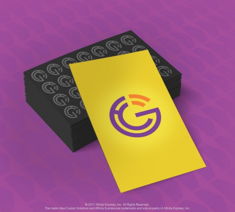
In pop culture, we are surrounded by logos that are so incredible, they have become recognizable across multiple generations, such as the golden arches, a silhouette of an apple or the black swoosh. Even these descriptors alone automatically trigger in most minds the brands they represent.

So, what are some lessons that you can learn from these icons when creating logos and branding for your business or your clients? Start with these four rules and you’ll be on your way to designing amazing logos!
1. Less is More. A consensus from multiple industry leaders is that the simpler the logo, the better. “Clean-cut, abstract logos are more easily recognizable and they simply don’t date,” says Michael Beirut, a partner at design consultancy Pentagram and also the designer behind Hilary Clinton’s 2016 presidential campaign logo. In the current consumer landscape, logos need to display properly across multiple platforms, surfaces and resolutions. The logo of businesses need to be flexible to adapt to these media.
2. Interactive and Dynamic Design. The definition of a logo has expanded beyond static images. A good example of this point is the Google Doodle. It has become as much of a pop culture icon, such that consumers know the Google identity, although the image changes. “We’re seeing more and more brands experiment with dynamic logo designs,” shares Anny Chen, Experience Designer at Adobe. “A brand can no longer rely on a singular and static logo mark to tell its story, but rather the definition of a logo has expanded into a system of parts (or logo sets) that is much more fluid and can work across the entire brand.”
3. Imperfect Works. The human brain has been proven to perceive objects as shapes and not as geometrically perfect. This allows brands the flexibility to forgo certain rules such as using geometrically perfect shapes. Take the Google “G”. Even though the “G” in the logo is not a perfect circle, the choice was made by a designer to achieve an optical balance. Were you to do a side-by-side comparison of the actual logo and a mathematically perfect execution of it, you would see that the “imperfect” one is visually more appealing.
4. Leave it to Professionals. Forbes said it best, “Just as you probably wouldn't let your cousin's intern son manage your accounting, the same should hold true for a logo.” It is much more than a symbol for your clients’ small businesses. It’s their calling card, their signature in the community and a visual representation of their brands. “Professional designers will ask all the right questions, research competitors and will be sure to create logos that are able to live and be viewed clearly on all platforms . . .”
It is true that logo design is an investment. Small businesses could opt for free tools, do-it-yourself approaches, templated designs or even crowd-sourcing options. The challenge is that most owners are not graphic design experts or objective enough to design for themselves. In some cases, they might get logos that are very similar to competitors, or even direct copies.
The solution is custom design. And it isn’t as cost-prohibitive as you would think. Companies like Idea Custom Solutions offer custom logo designs that are fast, creative and reasonably priced. Make sure you look for professional designers, a process that captures details about your business and competitive differentiators and enables you to revise concepts.

Add new comment