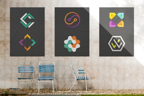
Creating a logo is more than just throwing together an image with a fun font and bright colors. Truly successful companies, such as Starbucks and Target, know the key to logo design actually lies in the psychology behind it. Each choice, from shape to color to font, delivers a specific message to customers.
Shapes
We’re going to name a few brands. Can you picture their shapes? Starbucks, McDonald’s, Target, Nike, National Geographic. It’s not difficult to envision them, is it? That’s because shape is one of the most easily recognized aspects of a logo — and it says more about a company than any other visual aspect. A circle, as in Starbucks’ logo, represents community and friendship, suggesting the coffeeshop chain is the perfect place to gather with loved ones. National Geographic’s iconic rectangle highlights the company’s authority level, being one of the most well-respected journalism brands. It looks solid and stable. Triangles — think Adidas — represent energy and purpose. And curves imply movement, comfort and protection; all things Nike’s swoop conveys with its sport products. Organic and hand-drawn shapes have their own purposes, too. Think of Whole Foods’ logo. The organic design makes people feel comfortable and communicates the idea that the stores offer hand-crafted and fresh products.
Colors
According to research by Colourfast, color plays a huge role in logo design: 84.7 percent say they buy a certain product based on color and 80 percent think color increases a brand’s recognition power. That’s because those colors have intense meanings behind them. Consider Playboy and the iconic black bunny. How do you feel about the company’s decision to use black? It makes the company seem more sophisticated and adds an air of seduction. Red, like Red Bull’s logo, elicits energy and action — exactly what an energy drink seeks to do. Calming hues of blue are perfect for companies that want to be seen as trustworthy, including Visa and Barclays. Green is a common choice for food-related companies (even though studies have shown food on green plates looks less appetizing) because it symbolizes fresh, organic ideals. Nickelodeon chose orange because it expresses everything the brand is known for: being happy, friendly and fun. Companies that want to go for a nostalgic air, like Hallmark often does, often shoot for purple.
Fonts
Rule number one: Don’t use Comic Sans! The font has garnered such a visceral negative reaction from people across the world that smart companies won’t touch it and with good reason. Who wants to work with a business having a logo that looks like a ten-year-old designed it? Believe it or not, font selection says quite a bit about a company. A font with serifs, for example, portrays reliability and reputability. It’s no wonder Wikipedia uses a serif font to help position the company as a knowledgeable authority. Google, on the other hand, chooses a sans-serif font, something that symbolizes ease-of-use and a neutral disposition. A script font reinforces creativity and elegance. Think Disney and Cadillac, which want to be known as creative and elegant, respectively. Modern fonts, such as Futura and Bodini, speak to the future and show a company is forward-looking. Novelty fonts showcase the uniqueness of a brand, for example, the spikey edges on Metallica’s logo. It just makes you imagine hard electric riffs, right?
Want to help your clients develop a logo that appeals to positive psychological dispositions? Let the experts at Idea Custom Solutions help you to help them. Check out our custom logo design service. It’s cost-effective, fast and creative.
Add new comment